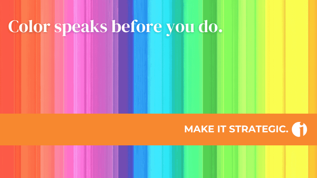
The Power of Color in Branding

Your palette shouldn’t just be “pretty,” it should be strategic.
Have you ever looked at a brand and felt something before you even read a single word?
That’s not accidental. That’s color psychology at work.
In the world of branding, your color choices aren’t just decorative, they’re a fast track to emotional resonance, memorability, and alignment with your audience’s subconscious expectations.
And in a sea of templates and trends, choosing the right palette can make the difference between a brand that blends in and one that boldly stands out.
Color Is Communication
Colors carry meaning. They activate associations and signal values. When chosen with intention, your palette becomes part of your messaging toolkit.
Here’s a quick primer on brand colors and what they tend to signal:
BLUE: Trust, stability, professionalism
- IBM, American Express, LinkedIn
- Often used by brands with a “Ruler” or “Sage” archetype
RED: Passion, urgency, power
- Coca-Cola, Netflix, Target
- Common with “Hero” and “Outlaw” brands
GREEN: Health, growth, balance
- Whole Foods, Spotify, Tropicana
- Typically aligned with “Caregiver” or “Explorer” archetypes
YELLOW: Optimism, clarity, cheerfulness
- McDonald’s, Snapchat, IKEA
- Often used by brands with an “Innocent” or “Everyperson” archetype
ORANGE: Creativity, enthusiasm, forward momentum
- Fanta, Amazon, HubSpot
- Common with “Creator” or “Explorer” brands
PURPLE: Imagination, luxury, wisdom
- Hallmark, Cadbury, Yahoo
- Typically aligned with “Magician” or “Royal” (Ruler) brands
PINK: Compassion, femininity, playfulness
- Barbie, T-Mobile, Glossier
- Often used by “Lover,” “Innocent,” or “Creator” brands
BLACK: Sophistication, power, elegance
- Chanel, Nike, Apple (product design)
- Common used by “Ruler” or “Magician” brands
GRAY: Balance, neutrality, professionalism
- Apple (branding), Mercedes-Benz, LinkedIn (UI elements)
- Typically with “Sage” or “Ruler” brands
Beige/Neutrals: Simplicity, calm, approachability
- Everlane, Airbnb (early branding), Glossier
- Often chosen by “Everyperson” or “Sage” brands
The iBrandStrategist Color Story
I didn’t choose my brand colors just because they looked good, I chose them to reflect the values and vision behind my work, especially for early-stage entrepreneurs building with intention.
ORANGE: My favorite color since childhood… bright, bold, and bursting with creativity. It embodies the Creator archetype that guides my work: helping brands come to life with originality, energy, and soul. Orange represents expressive thinking, purposeful momentum, and the confidence to stand out.
GREEN: Symbolizes growth, balance, and sustainability. It speaks to the holistic wellness of a business, how systems, values, and vision align to create lasting success. Green brings the grounding that turns ideas into strategy, and strategy into results.
BEIGE: Offers space, clarity, and neutrality… the “room to think” that entrepreneurs crave. It balances the bolder tones, much like holistic marketing brings structure to creative energy. Beige adds approachable warmth and reflects the thoughtful, human-centered approach I bring to every brand.
Together, these colors tell a story: energized, intentional growth, with clarity at the core.
So… What Colors Should You Choose?
Start with your brand’s archetype. Who are you in the story of your customer’s life?
- Are you a Guide helping them navigate complex decisions (like Google)?
- A Caregiver offering support and peace of mind (like Johnson & Johnson)?
- Or a bold Rebel challenging the status quo (like Harley-Davidson)?
Then ask:
- What do I want my audience to feel?
- How do I want my brand to show up in the world?
- What colors reinforce my values and message?
Spoiler alert: This is about ALIGNING with your brand’s mission, message, and audience.
Final Thought
Choosing brand colors may seem like a small decision, but it’s one of the most immediately impactful ones you’ll make.
- Done well, it creates coherence, recall, and connection.
- Done poorly, it sends mixed signals.
So be intentional. Be aligned. Be bold.
Because in a world where attention is short and impressions are fast, your colors are speaking before you ever say a word.
P.S. Your brand’s color palette and messaging should work hand in hand to tell a clear, compelling story. If you’re ready to align how your brand looks with how it speaks, then let’s start a conversation.
This newsletter is originally published to LinkedIn.
Click here to subscribe and get notified when a new issue is out!
It’s time to fast-track your branding and growth journey.
Schedule a 15-Minute Introduction Zoom Call
🟠 Dream it. Brand it. Make it.